Customization
1. Layouts
Choose a layout that fits well with your UI pattern. There are two types of layout options as listed below. The layout defaults to accordion if not explicitly specified.
1.1 Accordion layout
The accordion layout displays payment methods vertically using an accordion. To use this layout, set the value for layout to accordion. You also have the option to specify other properties, such as those shown in the following example.
var paymentElementOptions = {
 layout: {
   type: 'accordion',
   defaultCollapsed: false,
   radios: true,
   spacedAccordionItems: false
 },
}

—------or—---------


var paymentElementOptions = {
 layout: 'accordion'
}

<PaymentElement id="payment-element" options={paymentElementOptions} />
1.2 Tabs layout
The tabs layout displays payment methods horizontally using tabs. To use this layout, set the value for layout to tabs. You also have the option to specify other properties, such as tabs or collapsed.
var paymentElementOptions = {
 layout: 'tabs'
}

<PaymentElement id="payment-element" options={paymentElementOptions} />
1.2.1 Tabs layout - Grid arrangement
By default, the tabs layout shows excess payment methods inside a dropdown. If you want to display all payment methods at once in a grid view, you can customize the tabs layout using paymentMethodsArrangementForTabs.\
\
When paymentMethodsArrangementForTabs is set to grid, the tabs layout switches to a grid style
paymentMethodsArrangementForTabs supports the following values:
default– Shows excess payment methods in a dropdown (default).grid– Shows all payment methods in a grid without a dropdown.
To enable the grid arrangement in tabs layout, configure the layout object as shown below.
var paymentElementOptions = {
  layout: {
    type: 'tabs',
    paymentMethodsArrangementForTabs: 'grid'
  }
}

<PaymentElement id="payment-element" options={paymentElementOptions} />
1.3 Saved Methods Customization
In this layout, by default saved payment methods are shown for a quick checkout. Customers can select an existing method or add a new one using New payment methods, which reveals the payment form inline.\ \ This layout optimizes for faster repeat payments while still supporting new payment method entry in a single, seamless flow.\ \ One-click wallets such as Google Pay, Apple Pay, and PayPal are always shown at the top of the checkout to enable faster, low-friction payments. This is available for both Accordion and Tabs layout.
var paymentElementOptions = {
   layout: {
    savedMethodCustomization: {
      groupingBehavior: "groupByPaymentMethods",
    }
  }
}

<PaymentElement id="payment-element" options={paymentElementOptions} />
1.4 One Click Payment Methods Customization
By default, one-click payment methods such as Google Pay and Apple Pay are always displayed at the top of the checkout, regardless of the selected layout (Accordion or Tabs).
If you want to display one-click payment methods alongside other payment methods inside the layout instead of at the top, you can disable this behavior using displayOneClickPaymentMethodsOnTop.
When displayOneClickPaymentMethodsOnTop is set to false:
- Supported one-click methods are moved into the selected layout (Tabs or Accordion).
- Unsupported one-click methods are hidden.
To customize one-click payment method placement, configure the layout object as shown below.
var paymentElementOptions = {
   layout: {
    type: 'tabs',
    displayOneClickPaymentMethodsOnTop: false, //Default - true
  }
}

<PaymentElement id="payment-element" options={paymentElementOptions} />
Note: Currently, only Google Pay, Apple Pay, and PayPal (Redirect) support being moved into the layout. Other one-click methods are hidden when this option is disabled.
2. Wallets
The wallet customization feature lets users configure payment options like Apple Pay, Google Pay, PayPal, and Klarna. It includes a walletReturnUrl for post-payment redirects and a style property to customize the wallet's appearance, offering flexibility for seamless integration.
var paymentElementOptions = {
    wallets: {
      walletReturnUrl: `${window.location.origin}`,
      applePay: "auto",
      googlePay: "auto",
      payPal: "auto",
      klarna: "never",
      style: {
        theme: "dark",
        type: "default",
        height: 55,
        buttonRadius: 4,
      },
    },
  }

<PaymentElement id="payment-element" options={paymentElementOptions} />
| Variable | Description | Values |
|---|---|---|
| walletReturnUrl: string | Defines the URL to redirect users to after completing a payment. | This will take a URL string as its value |
applePay: showType |
Determines the visibility of Apple Pay, Google Pay, Paypal and Klarna. |
|
style: { |
Configures the wallet's appearance with the following options:
|
|
3. Styling variables
The Styling APIs could be used to blend the Unified Checkout with the rest of your app or website.
| Variable | Description |
|---|---|
| fontFamily | The font family is used throughout Widgets. Widget supports css fonts and custom fonts by passing the fonts option; reference to elements consumer |
| fontSizeBase | The font size that's set on the root of the Widget. By default, other font size variables like fontSizeXs or fontSizeSm are scaled from this value using rem units |
| spacingUnit | The base spacing unit that all other spacing is derived from. Increase or decrease this value to make your layout more or less spacious |
| borderRadius | The border radius used for tabs, inputs, and other components in the Widget |
| colorPrimary | A primary color used throughout the Widget. Set this to your primary brand color |
| colorBackground | The color used for the background of inputs, tabs, and other components in the Widget |
| colorText | The default text color used in the Widget |
| colorDanger | A color used to indicate errors or destructive actions in the Widget |
| fontVariantLigatures | The font-variant-ligatures setting of text in the Widget |
| fontVariationSettings | The font-variation-settings setting of text in the Widget |
| fontWeightLight | The font weight used for light text |
| fontWeightNormal | The font weight used for normal text |
| fontWeightMedium | The font weight used for medium text |
| fontWeightBold | The font weight used for bold text |
| fontLineHeight | The line-height setting of text in the Widget |
| fontSizeXl | The font size of extra-large text in the Widget. By default this is scaled from var(--fontSizeBase) using rem units |
| fontSizeLg | The font size of large text in the Widget. By default this is scaled from var(--fontSizeBase) using rem units |
| fontSizeSm | The font size of small text in the Widget. By default this is scaled from var(--fontSizeBase) using rem units |
| fontSizeXs | The font size of extra-small text in the Widget. By default this is scaled from var(--fontSizeBase) using rem units |
| fontSize2Xs | The font size of double-extra small text in the Widget. By default this is scaled from var(--fontSizeBase) using rem units |
| fontSize3Xs | The font size of triple-extra small text in the Widget. By default this is scaled from var(--fontSizeBase) using rem units |
| colorSuccess | A color used to indicate positive actions or successful results in the Element |
| colorWarning | A color used to indicate potentially destructive actions in the Element |
| colorPrimaryText | The color of text appearing on top of any a var(--colorPrimary) background |
| colorBackgroundText | The color of text appearing on top of any a var(--colorBackground) background |
| colorSuccessText | The color of text appearing on top of any a var(--colorSuccess) background |
| colorDangerText | The color of text appearing on top of any a var(--colorDanger) background |
| colorWarningText | The color of text appearing on top of any a var(--colorWarning) background |
| colorTextSecondary | The color used for text of secondary importance. For example, this color is used for the label of a tab that isn’t currently selected |
| colorTextPlaceholder | The color used for input placeholder text in the Widget |
4. Rules
The rules option is a map of CSS-like selectors to CSS properties, allowing granular customization of individual components. After defining your theme and variables, use rules to seamlessly integrate Elements to match the design of your site. The selector for a rule can target any of the public class names in the Element, as well as the supported states, pseudo-classes, and pseudo-elements for each class. For example, the following are valid selectors:
- .Tab, .Label, .Input, .InputLogo, .SaveWalletDetailsLabel, .OrPayUsingLabel, .TermsTextLabel, .InfoElement, .OrPayUsingLine
- .Tab:focus
- .Input--invalid, .Label--invalid, .InputLogo--invalid
- .Input::placeholder
- .billing-section, .billing-details-text
- .Input--empty, .InputLogo--empty
Each class name used in a selector supports an allowlist of CSS properties that you specify using camel case (for example, boxShadow for the box-shadow property). The following is the complete list of supported class names and corresponding states, pseudo-classes, and pseudo-elements.
Tabs
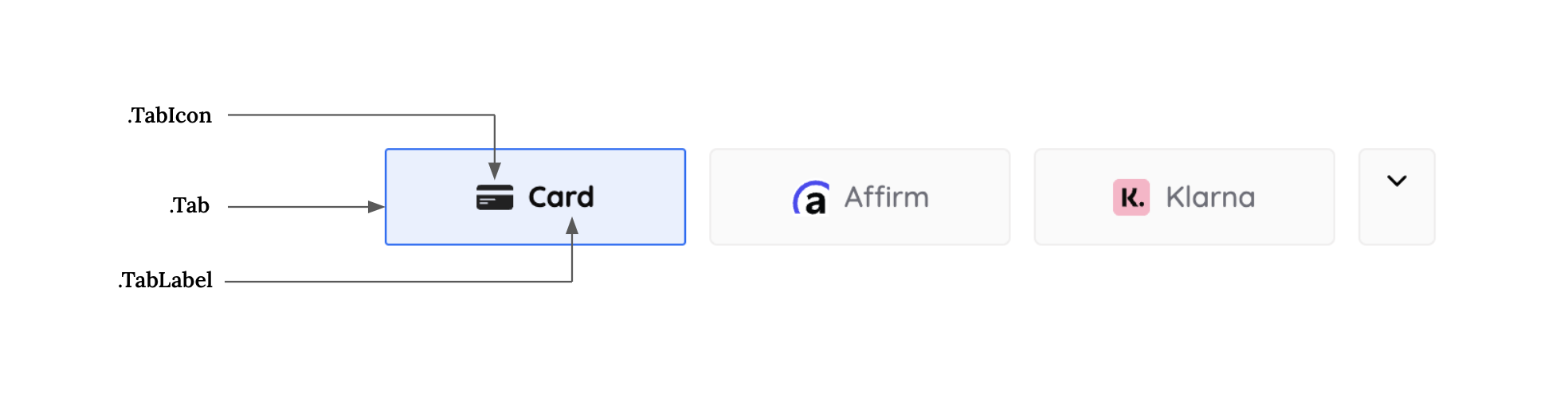
| Class Name | States | Pseudo-Classes | Pseudo-Elements |
|---|---|---|---|
| .Tabs | --selected | :hover, :focus, :active, :disabled | |
| fontSizeBase | --selected | :hover, :focus, :active, :disabled | |
| spacingUnit | --selected | :hover, :focus, :active, :disabled |
- .Tab, .Label, .Input
- .Tab:focus
- .Input--invalid, .Label--invalid
- .Input::placeholder
Each class name used in a selector supports an allowlist of CSS properties that you specify using camel case (for example, boxShadow for the box-shadow property). The following is the complete list of supported class names and corresponding states, pseudo-classes, and pseudo-elements.
const appearance = {
  variables: {
    buttonBackgroundColor: "#FFFFFF",
    buttonTextColor: "#000000",
    // ... along with other variables
  },
  rules: {
    ".TabLabel": {
      overflowWrap: "break-word",
    },
    ".Tab--selected": {
      display: "flex",
      gap: "8px",
      flexDirection: "row",
      justifyContent: "center",
      alignItems: "center",
      padding: "15px 32px",
      background: "linear-gradient(109deg,#f48836,#f4364c)",
      color: "#ffffff",
      fontWeight: "700",
      borderRadius: "25px",
    },
    ".Tab--selected:hover": {
      display: "flex",
      gap: "8px",
      flexDirection: "row",
      justifyContent: "center",
      alignItems: "center",
      padding: "15px 32px",
      background: "linear-gradient(109deg,#f48836,#f4364c)",
      borderRadius: "25px",
      color: "#ffffff !important",
      fontWeight: "700",
    },
  },
};

const elements = hyper.elements({ clientSecret, appearance });
Form Inputs
.png)
| Class Name | States | Pseudo-Classes | Pseudo-Elements |
|---|---|---|---|
| .Label | --empty, --invalid | ||
| .Input | --empty, --invalid | :hover, :focus, :disabled, :autofill | ::placeholder, ::selection |
| .Error |
Checkbox
.png)
| Class Name | States | Pseudo-Classes | Pseudo-Elements |
|---|---|---|---|
| .Checkbox | --checked | :hover | |
| .CheckboxLabel | --checked | :hover | |
| .CheckboxInput | --checked | :hover |
InputLogo

| Class Name | States | Pseudo-Classes | Pseudo-Elements |
|---|---|---|---|
| .InputLogo | :hover | ||
| .InputLogo | --invalid | :hover, | |
| .InputLogo | --empty | :hover |
SaveWalletDetailsLabel

| Class Name | States | Pseudo-Classes | Pseudo-Elements |
|---|---|---|---|
| .SaveWalletDetailsLabel | :hover |
OrPayUsingLabel
| Class Name | States | Pseudo-Classes | Pseudo-Elements |
|---|---|---|---|
| .OrPayUsingLabel | :hover |
OrPayUsingLine

| Class Name | States | Pseudo-Classes | Pseudo-Elements |
|---|---|---|---|
| .OrPayUsingLine | :hover |
TermsTextLabel

| Class Name | States | Pseudo-Classes | Pseudo-Elements |
|---|---|---|---|
| .TermsTextLabel | :hover |
InfoElement

| Class Name | States | Pseudo-Classes | Pseudo-Elements |
|---|---|---|---|
| .InfoElement | :hover |
5. Languages
Hyperswitch Unified Checkout supports localization in 6 languages. By default, the Unified Checkout SDK will detect the locale of the customer’s browser and display the localized version of the payment sheet if that locale is supported. In case it is not supported, we default to English. To override, you can send locale in hyper.elements (options)
We support the following locales -
- Arabic (ar)
- Catalan (ca)
- Chinese (zh)
- Deutsch (de)
- Dutch (nl)
- English (en)
- EnglishGB (en-GB)
- FrenchBelgium (fr-BE)
- French (fr)
- Hebrew (he)
- Italian (it)
- Japanese (ja)
- Polish (pl)
- Portuguese (pt)
- Russian (ru)
- Spanish (es)
- Swedish (sv)
If you need support for locales other than the ones mentioned above, please contact the Hyperswitch team. Now you can test the payments on your app and go-live!
6. Confirm Button
The Styling APIs could be used to blend the Confirm Payment Button (handled by SDK) with your app.
| Variable | Description |
|---|---|
| buttonBackgroundColor | Sets the background color of the payment button |
| buttonHeight | Define the height of the payment button |
| buttonWidth | Specify the width of the payment button |
| buttonBorderRadius | Adjust the border radius of the payment button for rounded corners |
| buttonBorderColor | Sets the color of the border surrounding the payment button |
| buttonTextColor | Define the color of the text displayed on the payment button |
| buttonTextFontSize | Customize the font size of the text on the payment button |
| buttonTextFontWeight | Specify the font weight of the text on the payment button |
| buttonBorderWidth | Specify the border width of the button |
7. More Configurations
Branding
You can decide whether to display the Hyperswitch branding using the branding prop
var paymentElementOptions = {
 ...,
 branding: "never", // choose between "never" and "always"
}

<PaymentElement id="payment-element" options={paymentElementOptions} />
Payment Methods Header Text
Customize the header text for the section displaying available payment methods.
var paymentElementOptions = {
 ...,
 paymentMethodsHeaderText: "Select Payment Method",
}

<PaymentElement id="payment-element" options={paymentElementOptions} />
Saved Payment Methods Header Text
Customize the header text for the section displaying saved payment methods.
var paymentElementOptions = {
 ...,
 savedPaymentMethodsHeaderText: "Saved Payment Methods",
}

<PaymentElement id="payment-element" options={paymentElementOptions} />
Custom Message for Card Terms
We provide a default message for card terms i.e.
`By providing your card information, you allow ${company_name} to charge your card for future payments in accordance with their terms.`
If you would like to customize this message, you can do so by using the customMessageForCardTerms property in the paymentElementOptions object.
var paymentElementOptions = {
 ...,
 customMessageForCardTerms: "Custom message for Card terms",
}

<PaymentElement id="payment-element" options={paymentElementOptions} />
Hide Card Nickname Field
The hideCardNicknameField property allows you to hide the card nickname field when saving a card.
var paymentElementOptions = {
  ...,
  hideCardNicknameField: true,  // default - false
};

<PaymentElement id="payment-element" options={paymentElementOptions} />;
Hide Expired Saved Payment Methods
The hideExpiredPaymentMethods property allows you to control whether expired saved payment methods are hidden or not.
var paymentElementOptions = {
  ...,
  hideExpiredPaymentMethods: false, // default - false
};

<PaymentElement id="payment-element" options={paymentElementOptions} />;
Terms
The terms property allows you to configure the display of terms for various payment methods.
var paymentElementOptions = {
  ...,
  terms: {
    auBecsDebit: "always",
    bancontact: "auto",
    card: "never",
    ideal: "auto",
    sepaDebit: "always",
    sofort: "never",
    usBankAccount: "auto",
  },
};

<PaymentElement id="payment-element" options={paymentElementOptions} />;
Display Saved Payment Methods
The displaySavedPaymentMethods property determines whether saved payment methods are displayed.
var paymentElementOptions = {
  ...,
  displaySavedPaymentMethods: false,
};

<PaymentElement id="payment-element" options={paymentElementOptions} />;
Display Saved Payment Methods Checkbox
The displaySavedPaymentMethodsCheckbox property determines whether the "Save payment methods" checkbox is displayed.
var paymentElementOptions = {
  ...,
  displaySavedPaymentMethodsCheckbox: false,
};

<PaymentElement id="payment-element" options={paymentElementOptions} />;
Saved Payment Methods Checkbox Checked By Default
The savedPaymentMethodsCheckboxCheckedByDefault property determines whether the "Save payment methods" checkbox is checked by default when displayed.
var paymentElementOptions = {
  ...,
  savedPaymentMethodsCheckboxCheckedByDefault: false, // default - false
};

<PaymentElement id="payment-element" options={paymentElementOptions} />;
Payment Method Order
The paymentMethodOrder property allows you to specify the order in which payment methods are displayed.
var paymentElementOptions = {
  ...,
  paymentMethodOrder: ["card", "ideal", "sepaDebit", "sofort"],
};

<PaymentElement id="payment-element" options={paymentElementOptions} />;
Business
The business property allows you to specify a business name to be attached to the terms. By default merchant name will be taken as business name.
var paymentElementOptions = {
  ...,
  business: {
    name: "Example Business",
  },
};

<PaymentElement id="payment-element" options={paymentElementOptions} />;
Read Only
The readOnly property puts the SDK into read-only mode, disabling all interactions.
var paymentElementOptions = {
  ...,
  readOnly: true,
};

<PaymentElement id="payment-element" options={paymentElementOptions} />;
Show Short Surcharge Message
The showShortSurchargeMessage property allows merchants to display a short message when a surcharge is applied, instead of the default message provided by the SDK.
The short message format will be: Fee: {Currency} {Amount}
var paymentElementOptions = {
  ...,
  showShortSurchargeMessage: true, // default - false
};

<PaymentElement id="payment-element" options={paymentElementOptions} />;